
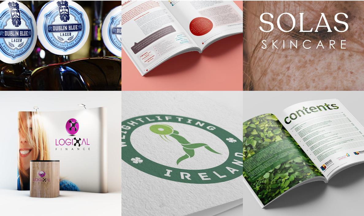
In today’s fast-moving digital world, your logo is often the very first interaction a customer has with your brand long before they read your story, browse your products, or engage with your website. That’s why company logo design continues to evolve as brands compete for attention, recognition, and emotional connection. New design trends emerge every year, pushing businesses to rethink how they present themselves visually.
But here’s the big question:
Should you follow these trends, or should you stick to something timeless?
In this in-depth guide, we explore the most influential company logo design trends shaping modern branding, why they matter, and whether they’re the right choice for your business. We’ll also cover how these trends connect with broader branding elements including your website, marketing materials, and even package design services.
Why Logo Trends Matter in Modern Branding
Before looking at specific trends, it’s important to understand why trends play a significant role in the design world.
Your audience’s expectations change every few years. Design styles that once felt fresh (like glossy 3D logos in the 2000s) now seem outdated. Brands that don’t evolve visually risk looking irrelevant or old-fashioned.
However, blindly following trends can also backfire. The goal should never be to simply “look trendy” it should be to stay aligned with your brand values, customer experience, and long-term identity.
A strong company logo design must balance:
Longevity – so it doesn’t need constant redesigns
Relevance – so it feels modern and trustworthy
Uniqueness – so it stands out in a crowded market
With that in mind, let’s explore the trends shaping logo design today.
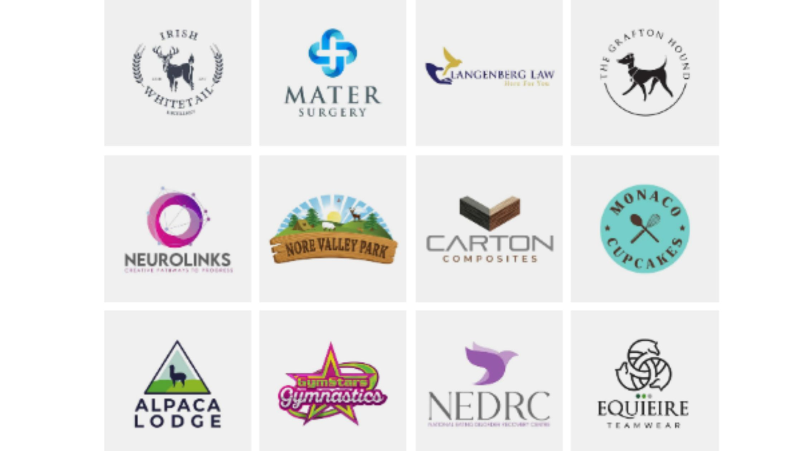
Top Trends in Company Logo Design Shaping Modern Branding
1. Minimalism and Simplification
Minimalism remains the most powerful and dominant trend in company logo design. Brands across all industries from tech to fashion are simplifying their logos to look cleaner, more versatile, and easier to recognize.
Why this trend works:
It scales well across devices and sizes
It’s easier to recognize globally
It aligns with modern digital aesthetics
Examples in the real world:
Brands like Airbnb, Spotify, and Nissan have all moved toward simpler, flat designs.
Should you follow this trend?
Yes, if your brand values clarity, modernity, and digital performance. Minimal logos also work extremely well across package design services, where space and visibility matter.
2. Geometric Shapes and Mathematical Precision
Geometric-based logos are rising in popularity thanks to their clean lines and visual symmetry. Circles, triangles, and grids create a sense of stability and structure ideal for brands wanting to appear credible and trustworthy.
Why this trend works:
It offers a strong visual foundation
It communicates order and balance
It appeals to a wide audience
Should you follow this trend?
This trend is ideal for tech companies, financial institutions, engineering firms, and brands that rely on precision. But if your brand is more playful or human-centered, geometric designs may feel too rigid.
3. Bold Typography and Custom Typefaces
A growing number of brands are ditching symbols entirely and using typography-only logos. Custom typefaces help companies establish a distinctive voice that no competitor can replicate.
Why this trend works:
Typography can convey personality
It’s easy to scale and adapt
It creates a memorable visual identity
Should you follow this trend?
If your brand name is short and distinctive, this trend can work extremely well. It also integrates beautifully with packaging, where clean typography enhances readability and premium appeal.
4. Vibrant Gradients and Dynamic Color Palettes
Once considered outdated after the early 2000s, gradients have made a big comeback. Today’s gradients are more sophisticated, subtle, and refined.
Why this trend works:
It adds depth and movement
It feels energetic and innovative
It attracts younger audiences
This trend has been embraced heavily in tech, digital services, and creative industries.
Should you follow this trend?
Use gradients if you want your brand to appear modern and dynamic. They also work well in digital-first brands, but you’ll need to ensure the gradient translates well in print and on packaging.
5. Hand-Drawn, Organic, and Raw Designs
As brands crave authenticity, many are shifting toward handcrafted or raw logo styles. These include hand-drawn illustrations, imperfect shapes, or textured lines.
Why this trend works:
It communicates uniqueness and personality
It feels human, warm, and approachable
It stands out from overly digital or “perfect” logos
Should you follow this trend?
Ideal for artisans, boutique brands, cafés, organic products, and eco-conscious companies. This style also pairs beautifully with package design services, especially when natural textures or earthy tones are used.
6. Monograms and Lettermarks
Monograms are timeless but they’ve recently surged as brands look for compact, powerful identifiers. Think HP, IBM, or Chanel.
Why this trend works:
It delivers strong recognition in small spaces
It looks luxurious and professional
It adapts well to both digital and print
Should you follow this trend?
This is a great choice for long brand names or companies needing a more refined, elegant look.
7. Responsive and Adaptive Logo Systems
Logos are no longer static they must work on websites, apps, packaging, social media, signage, and more. Many brands are creating adaptive logo systems instead of one fixed layout.
Why this trend works:
Improves usability across multiple platforms
Ensures consistent visibility and recognition
Allows flexible variations while maintaining identity
Should you follow this trend?
If your brand is digital-first, highly scalable, or global, responsive logo systems are a smart investment.
Should You Follow These Trends? A Practical Guide
Following trends can be beneficial but only if they align with your brand’s personality and long-term goals.
You should embrace logo trends when:
Your current logo feels outdated
Your brand is shifting direction
You’re rebranding to reach new demographics
You need better digital performance
But avoid trends when:
They conflict with your brand’s story
Your industry requires a classic aesthetic
You’re chasing trends purely to “look modern”
Your audience prefers tradition and stability
The key is balance use trends as inspiration, not as strict rules.
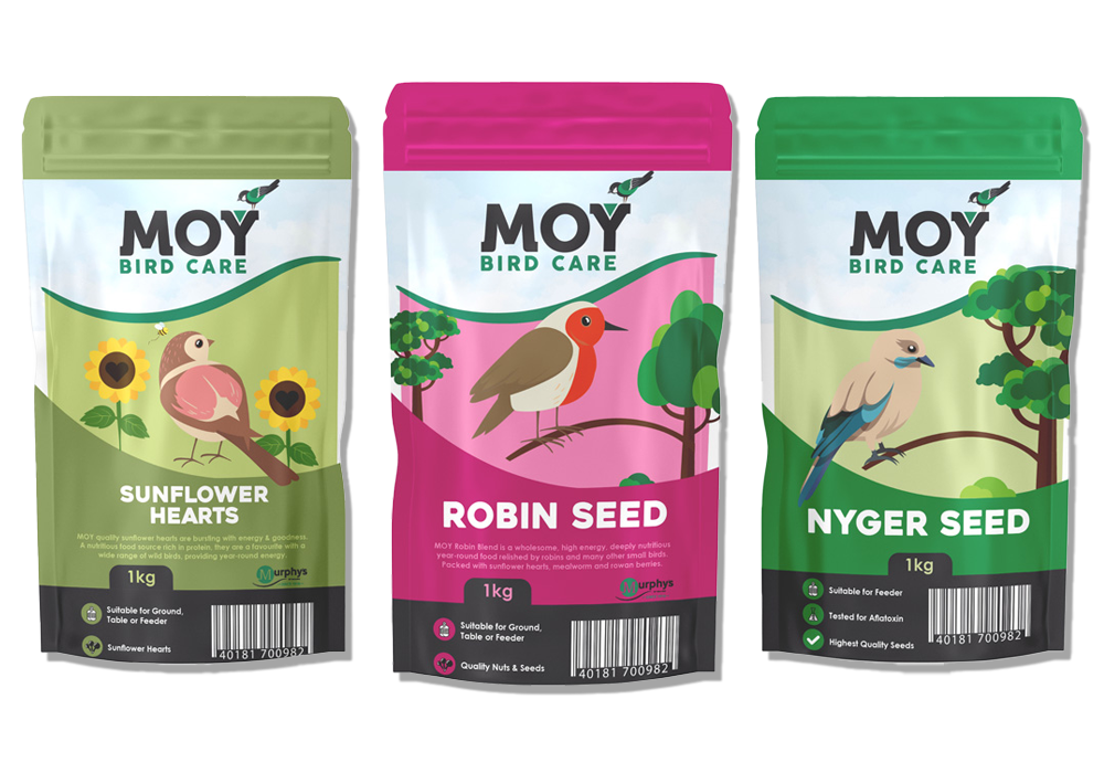
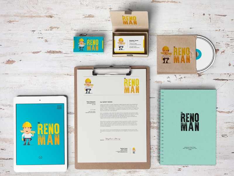
How Logo Trends Tie Into Package Design Services and Overall Branding
Your logo is just one part of your brand identity it must work seamlessly across all touchpoints, especially packaging.
A well-designed logo should pair effectively with:
Product packaging
Labels and inserts
Retail displays
Shipping materials
Digital packaging mockups
Brands offering package design services pay close attention to logo trends because packaging is often the main visual driver of sales, especially in retail environments.
A modern logo enhances:
Shelf visibility
Consumer trust
Brand storytelling
Product consistency
If you're updating your company logo design, it may be the perfect time to refresh your packaging as well.


Write a comment ...